
Case Study:
Glen Hollow Whiskey
-Crafted by Landscape
Brand Identity & Structural Packaging
Overview:
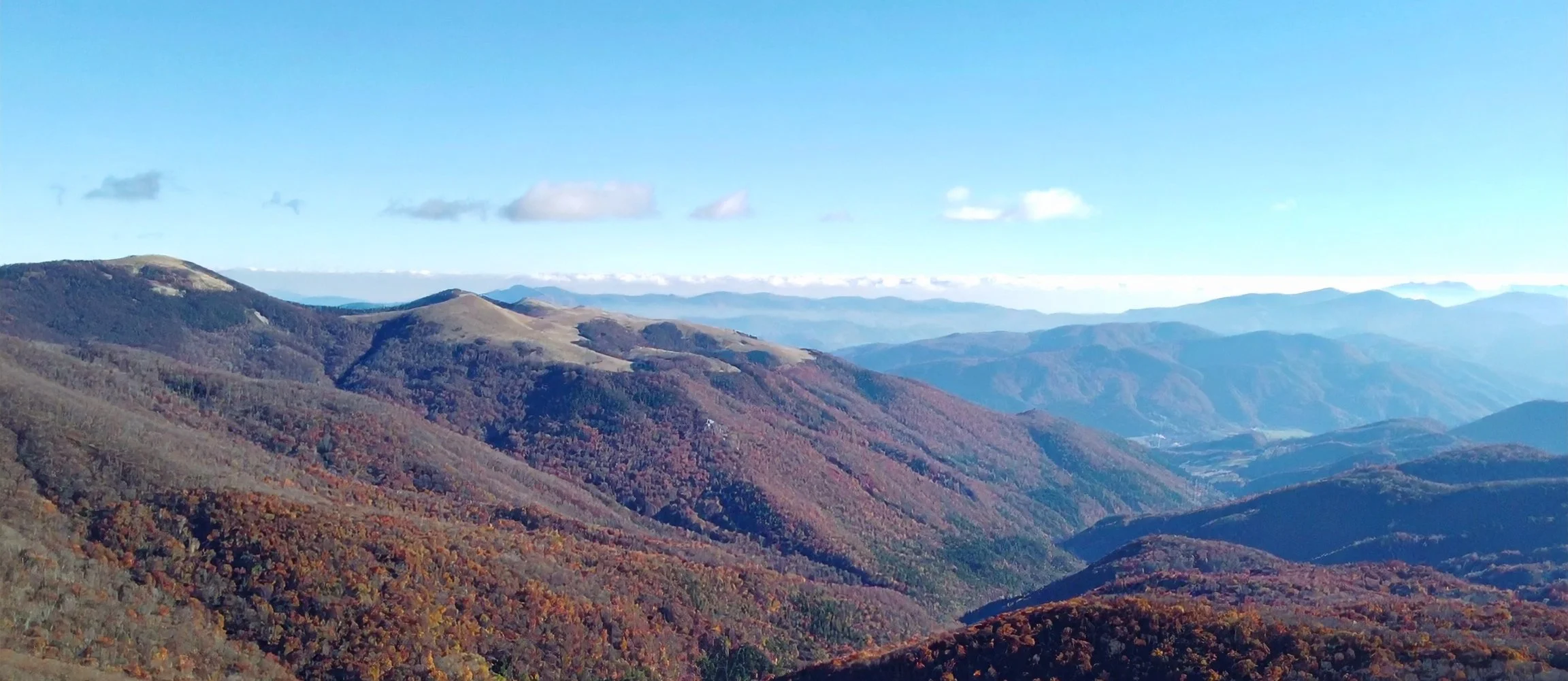
Glen Hollow is a modern American whiskey rooted in the quiet, rugged beauty of the Catskill Mountains. Departing from the ornate crests, embellishments, and legacy cues typical of whiskey branding, the identity reflects a deeper connection to the land - inviting drinkers into a sense of grounded calm. Our role was to develop a holistic identity and packaging system that embodies this spirit through material, form, texture, and detail.
Our Role
Brand Identity / Structural Design / CMF / Design for Manufacturing
Approach:
-Designed to feel rooted and timeless, while still standing apart in a crowded category.
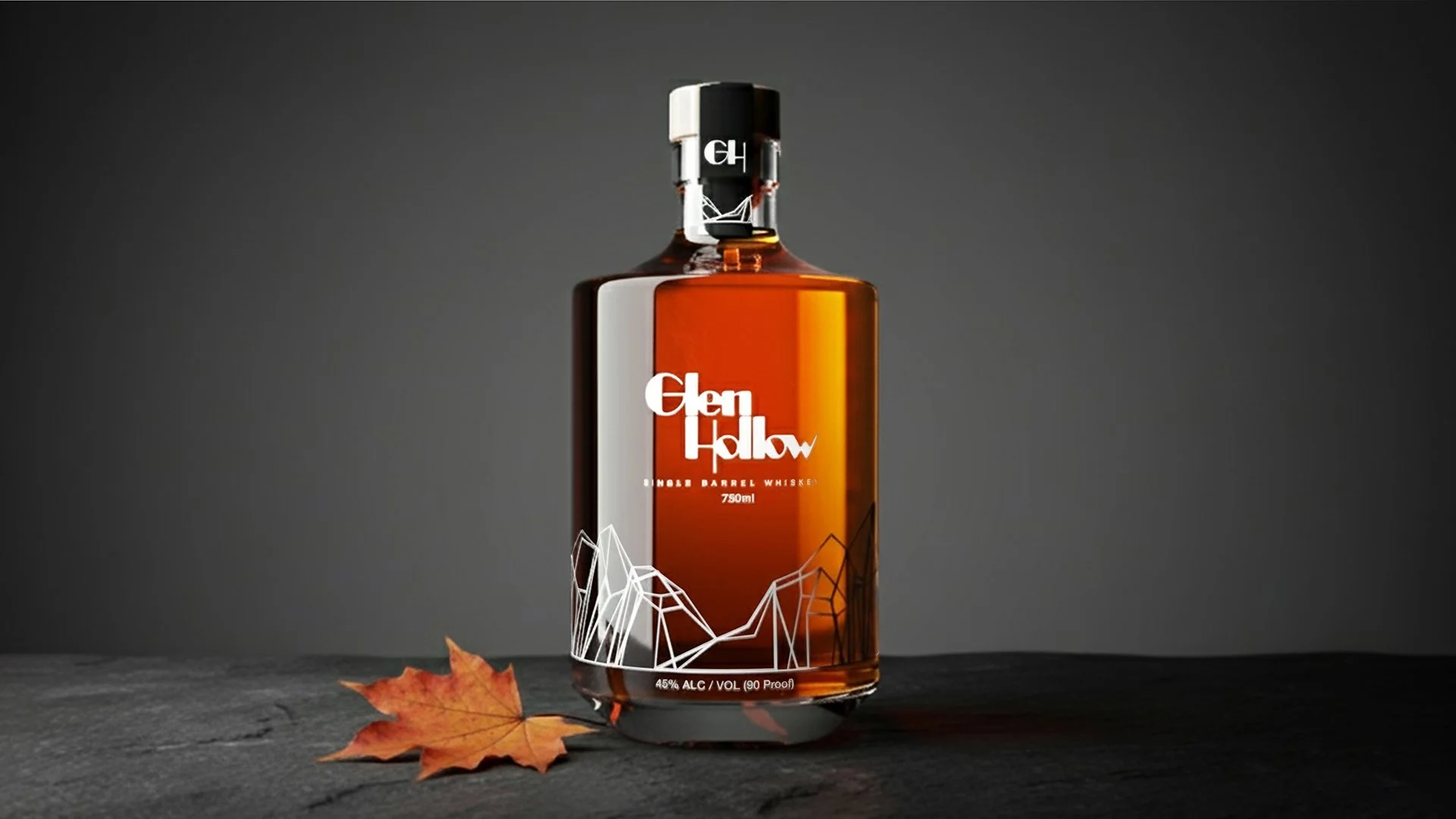
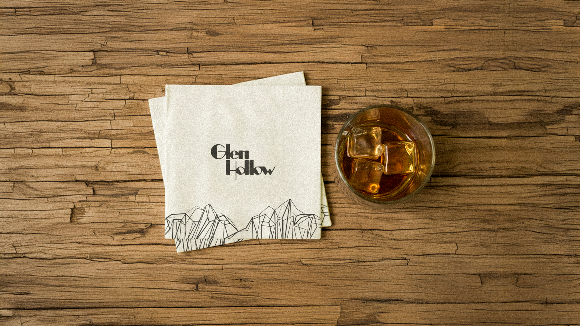
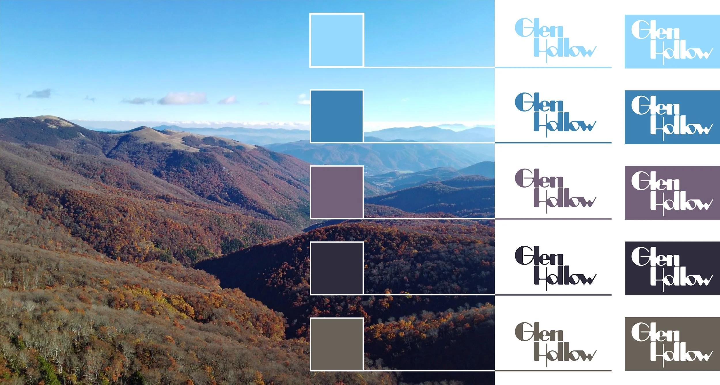
The visual identity was built to reflect the brand’s core values: restraint, rugged elegance, and a deep connection to nature. The wordmark uses a bold, contemporary typeface with unique letterforms that feel both modern and grounded - much like the whiskey itself. Beneath the wordmark, the angular terrain illustration anchors the brand to its environment. A graphic representation that lends itself well for glass printing, laser engraving, packaging, and digital assets, where detail must balance legibility and form.
Packaging:
-Designed to feel at home on a weathered wood shelf in a mountain cabin, yet stand confidently in a premium retail setting.
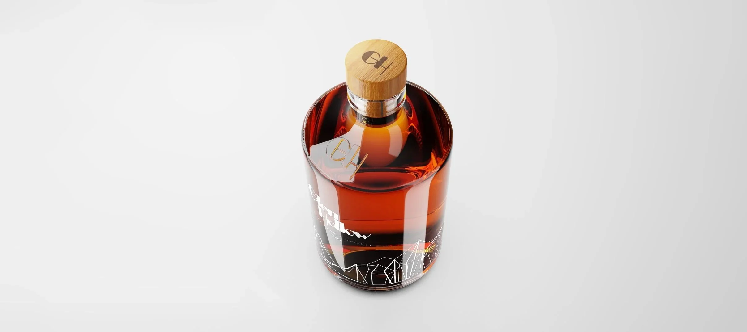
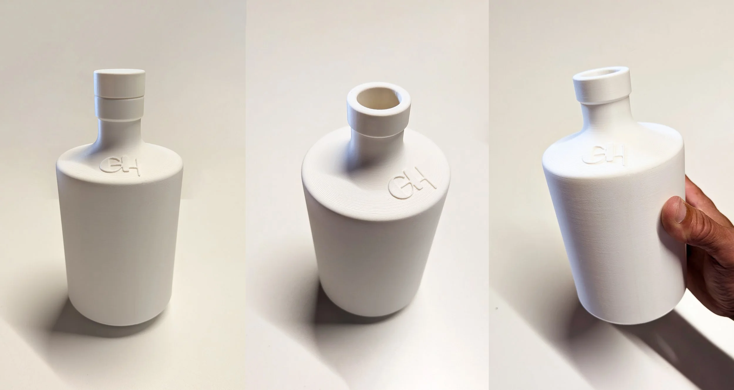
The bottle itself features a simple, confident silhouette with a wide base and minimal ornamentation. Its quiet geometry allows the storytelling to emerge through material, texture, and detail. All graphics are printed directly onto the glass using a single color, enamel-like application. A stylized line drawing of the mountainous terrain wraps subtly around the lower third of the bottle - a gesture that roots the product in place without overwhelming the design. An embossed monogram reinforce a sense of craft and permanence.


Secondary Packaging:
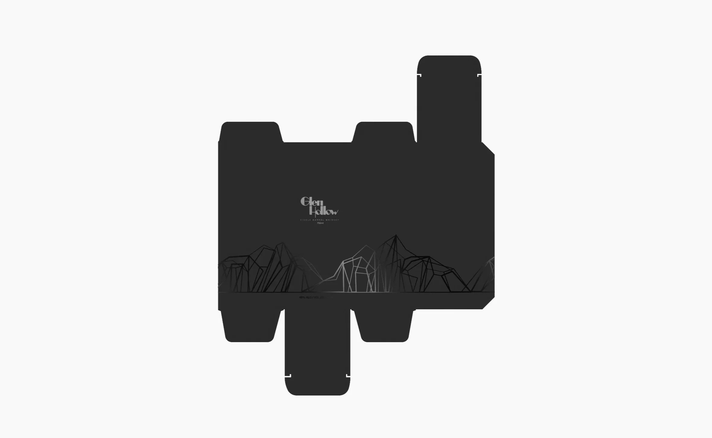
The secondary packaging follows the same restrained design philosophy as the bottle itself. A matte black carton carries the wordmark in a subtle gloss finish, relying on the texture shift rather than a bold printed graphic. This quiet contrast mirrors the direct-to-glass printing used on the bottle, ensuring that both primary and secondary packaging share a unified voice. The result is a consistent brand expression that feels understated, elevated, and true to the brands’ connection to material and place.

Product Experience:
-Ensuring consistency across every touchpoint, from distillery to retail.
The system is built to scale - equally effective on bottles, shipping cartons, signage, digital assets, and even laser-engraved barrel heads used for aging and in-store display.

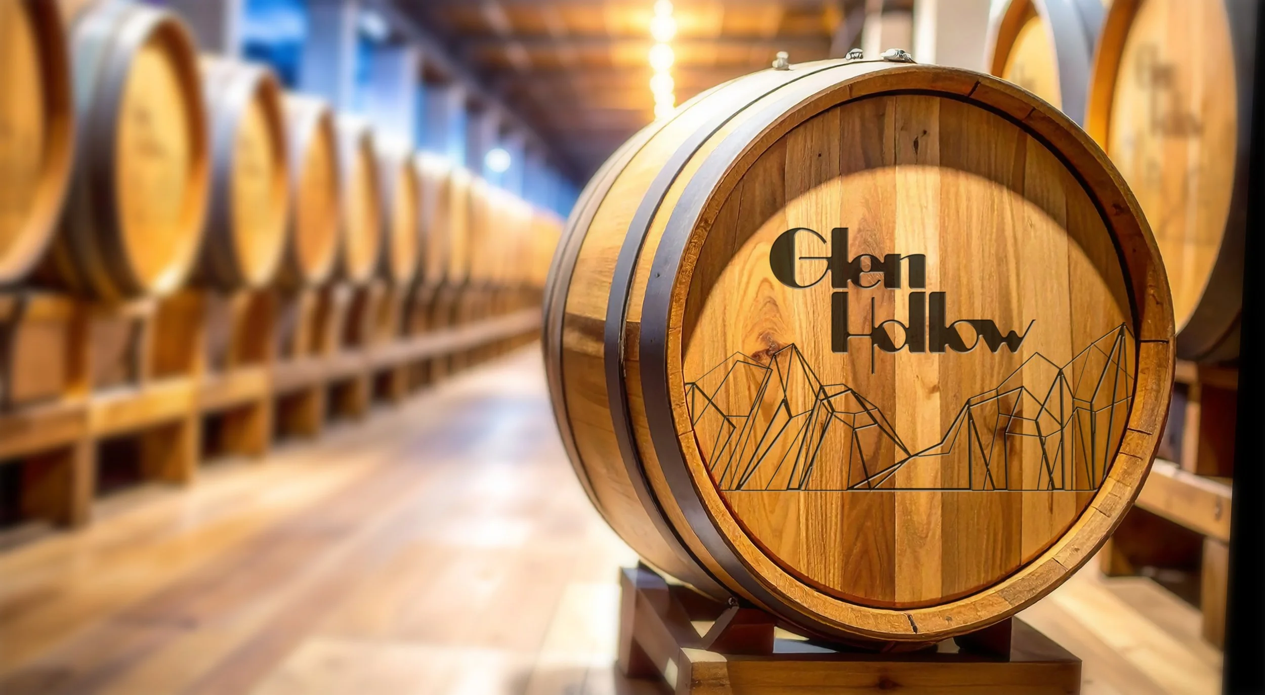
-Every decision ties back to the landscape - from the brand voice, to the color palatte, to the physical structure. Glen Hollow isn’t just a whiskey you drink - it’s a place you feel.


Technical Execution:
-Product experience living into brand promise.
From early, iterative concept development, 3D printing and prototyping, to finalized CAD modeling, dimensioned dielines, and material specifications - design intent is carried through to production without compromise - bridging the gap between brand storytelling and real-world performance.


Impact:
Glen Hollow doesn’t chase trends or mimic legacy cues - it carves its own path through restraint, quality, and connection to place. The result is a whiskey brand that feels both elevated and elemental - a quiet standout in a crowded market.
